
NEXUS
The brief: Nexus needed a brand that could hold its ground in a crowded health and longevity category, one built on clinical credibility rather than wellness fluff. The challenge was translating a data-driven, science-backed approach into a brand people would actually trust with their biology.
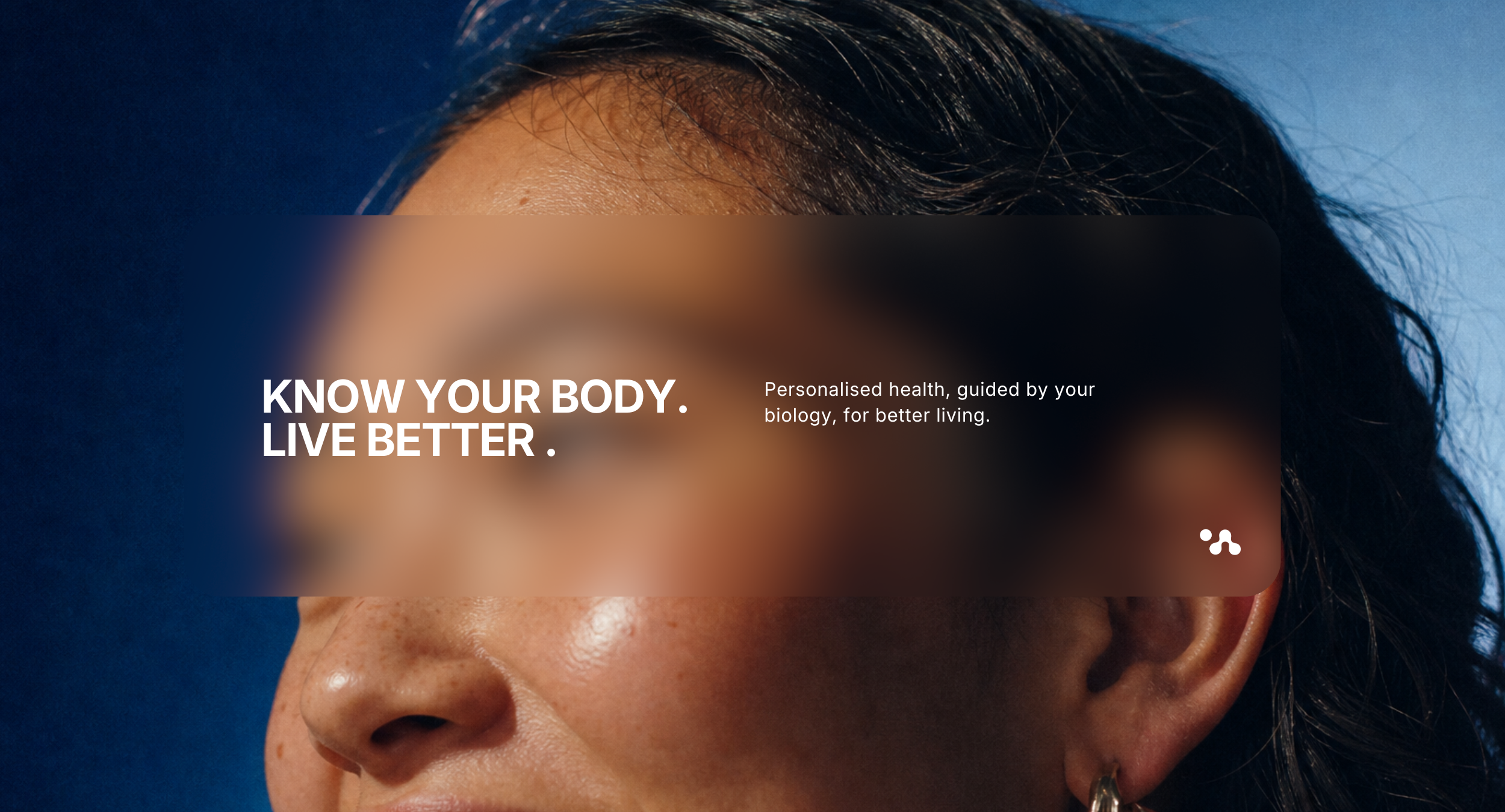
The story/message: Nexus exists for people who refuse to accept that ageing means decline. We built the brand around a simple proposition, Know Your Body. Live Better, turning complex clinical insight into something personal and usable. The name, messaging and positioning all work to move health from something that happens to you into something you understand and direct.
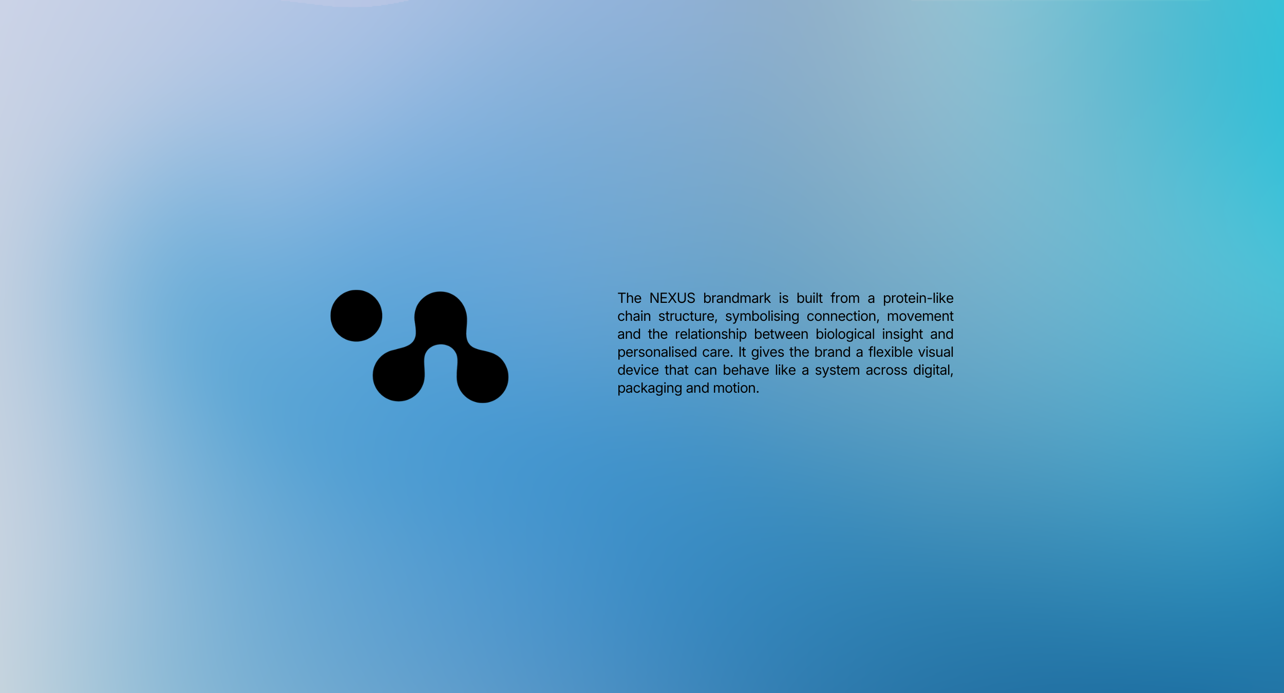
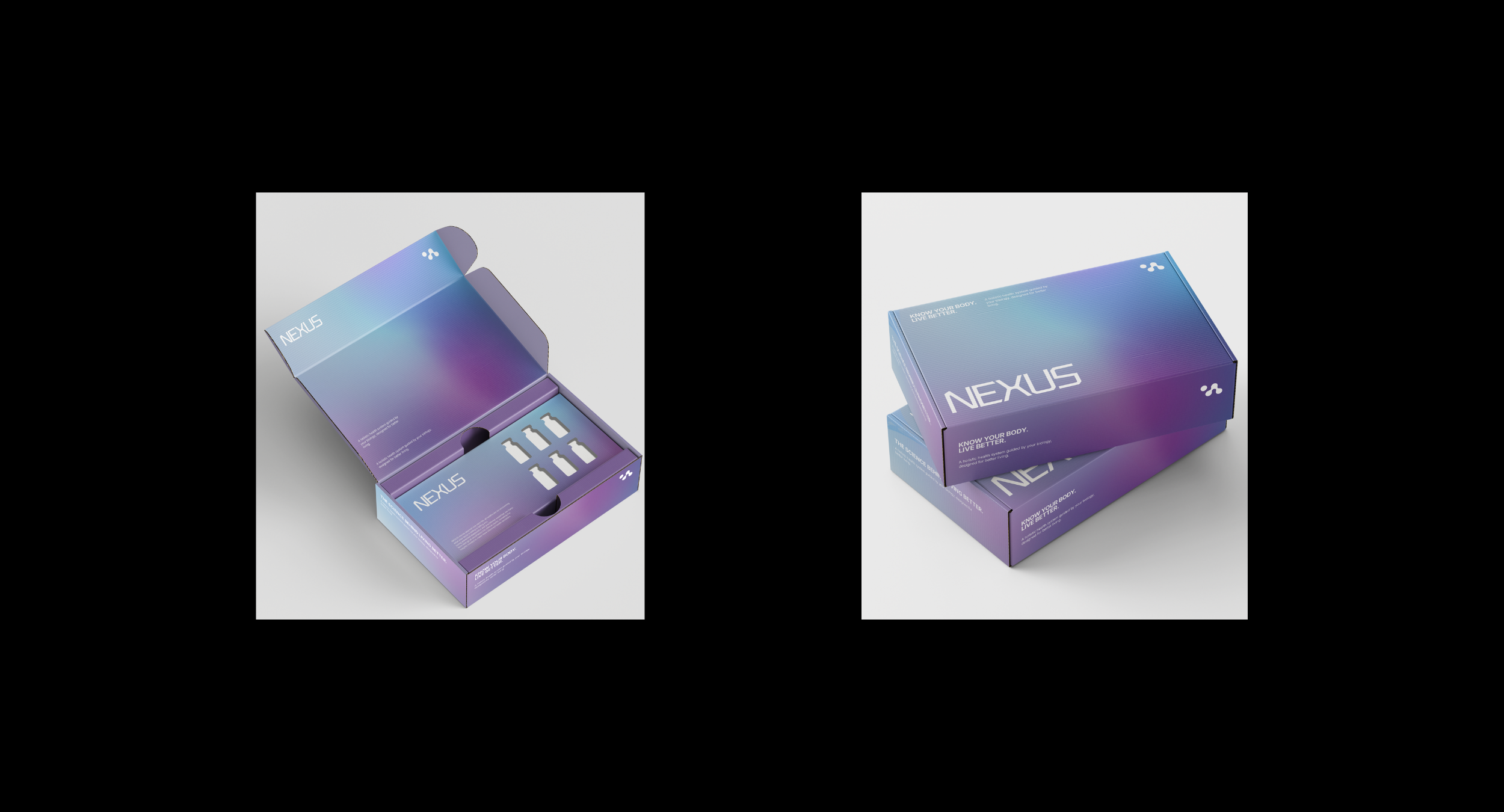
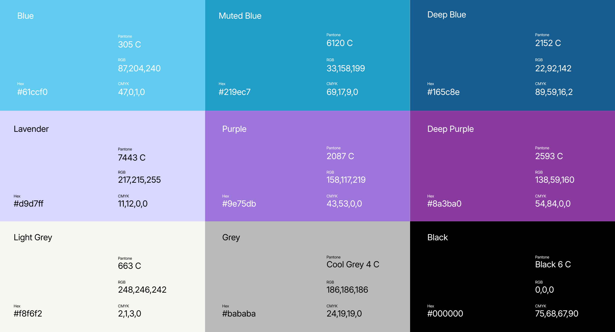
The look: The visual identity needed to feel premium and clinical without tipping into cold or corporate. We developed a full logo suite and brandmark, a considered typography system and a colour and design language built to work consistently across the website, the member product experience and investor-facing material, so Nexus reads the same whether someone's meeting the brand for the first time or living inside it every day.
SCOPE
+ Brand Identity Strategy
+ Communications approach (messaging)
+ Visual Identity (logo & brand mark)
+ Website design & development