PATCH PLANNING
Introducing Patch Planning - Connecting people, policy and place.
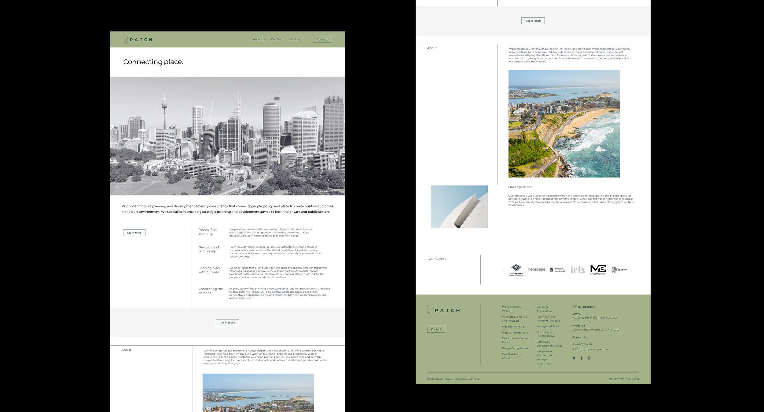
The brief: Revitalise Patch Planning’s brand by enhancing its communication strategy and evolving its visual identity to strengthen market positioning and foster deeper connections with ideal clients.
The message: There was a clear opportunity to shift Patch Planning’s communications from simply outlining services to meaningfully expressing the value and outcomes they deliver. At its heart Pacth connects people, policy and place.
The look: We refined the structure of the brand mark and logo by introducing sharper and thinner lines, moving away from rounded edges. The linework creates a cleaner, modern, premium feel while remaining approachable and true to the already established brand. The brand collateral follows suit - elevated and refined - strengthening Patch Planning’s market positioning and presence.
SCOPE
+ Brand Identity Strategy
+ Communications approach (messaging)
+ Visual Identity (logo & brand mark)
+ Website design & development


