
THE BLOODY GOOD FOUNDATION
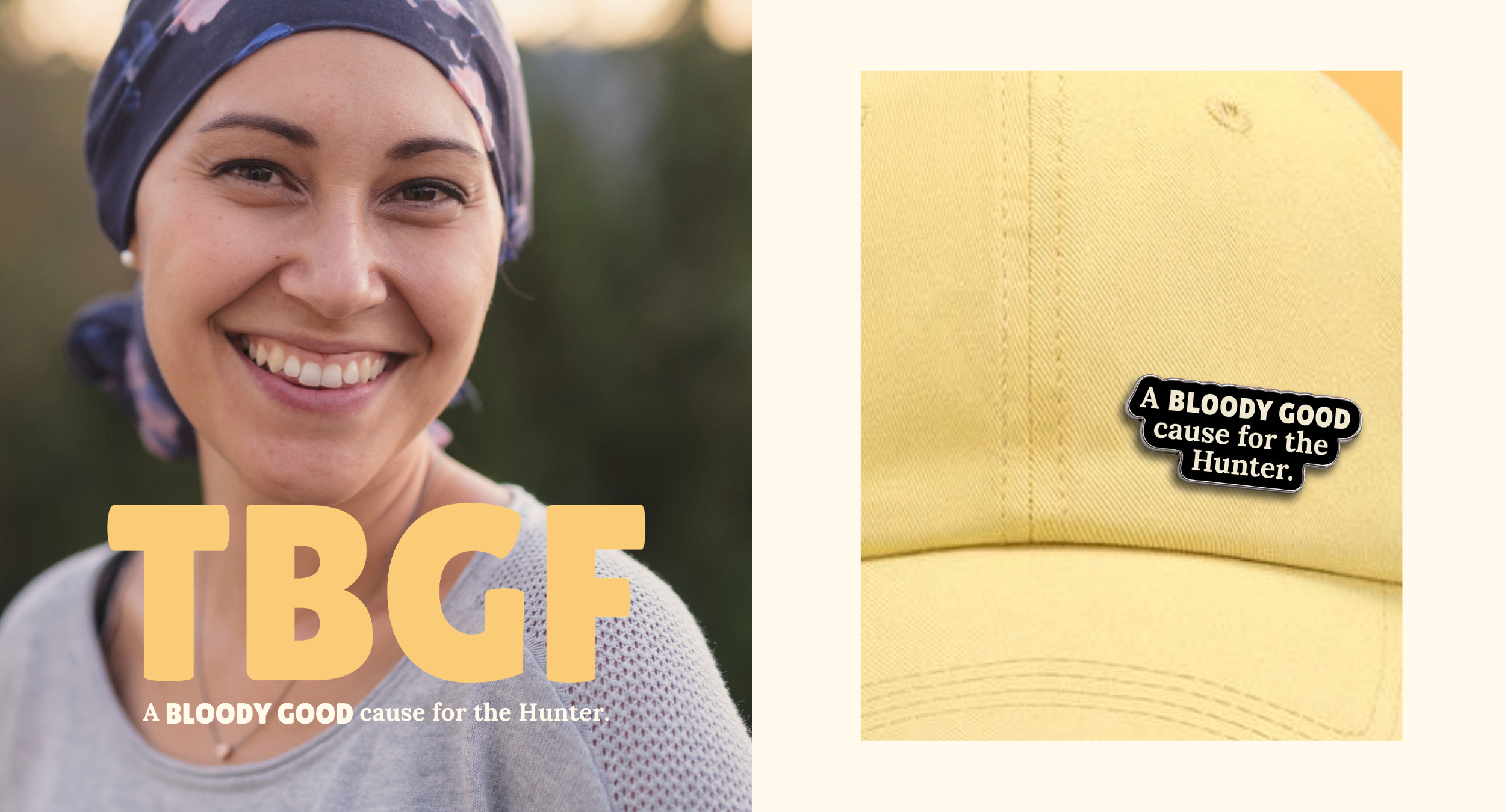
The brief: The Bloody Good Foundation started as a social media idea from two local legends. They needed a brand to turn the idea into something much bigger: the Hunter's only charity dedicated exclusively to blood cancer. The opportunity was to create a charity brand with real heart and a sense of humour, one the whole of Newcastle would want to get behind.
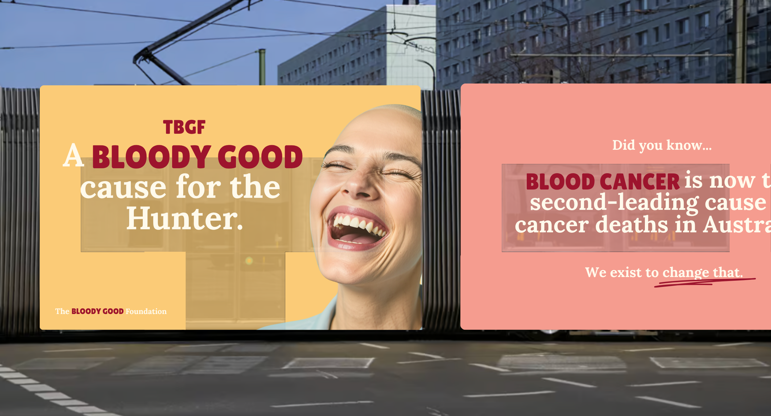
The story/message: At the heart of The Bloody Good Foundation is a simple call to action: let's do some bloody good together. The name says what the cause is about with a turn of phrase every local knows, and the messaging follows suit. Warm, direct and a little cheeky, the brand speaks to the community in its own language and makes a tough subject easier to talk about.
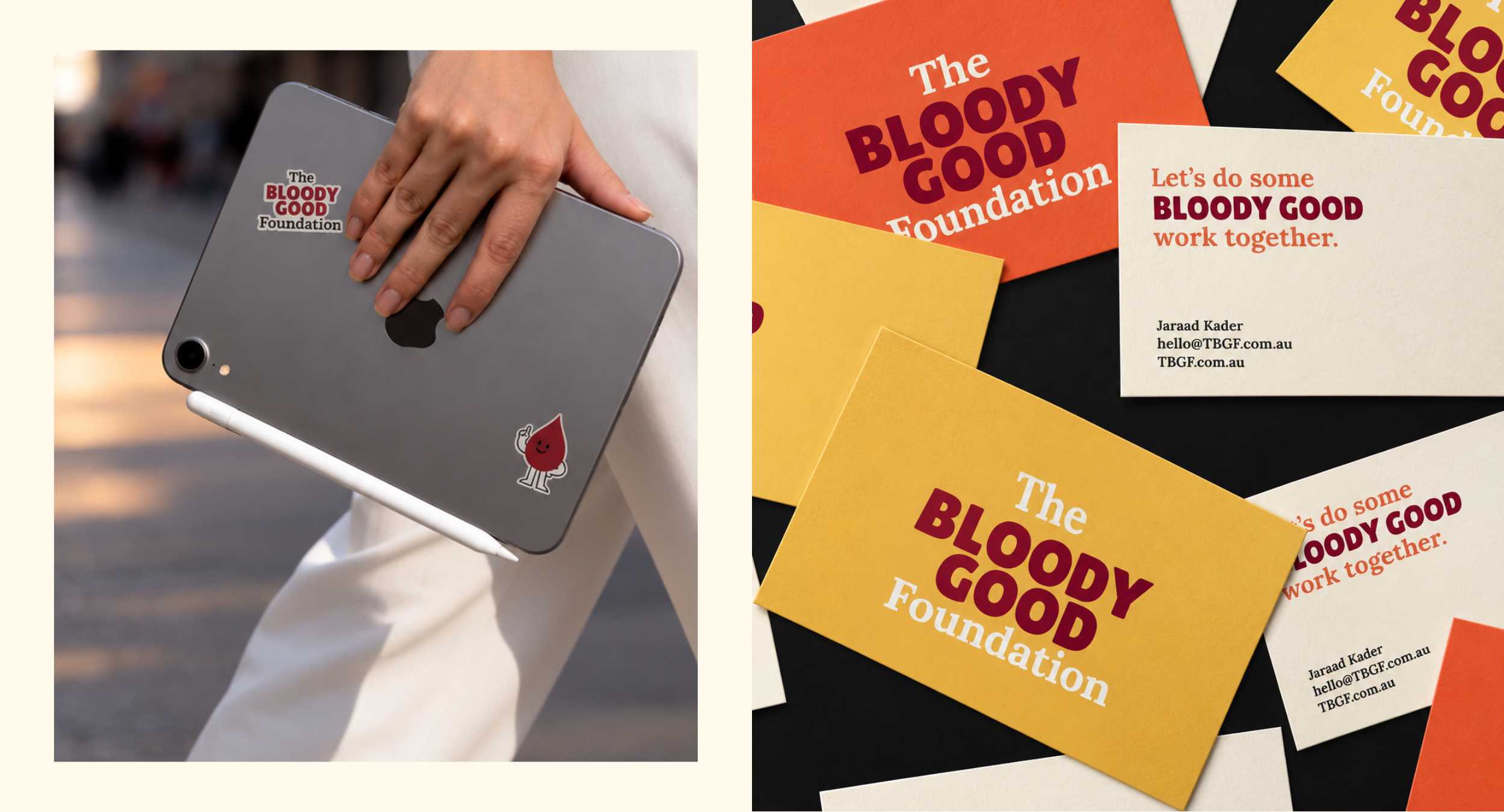
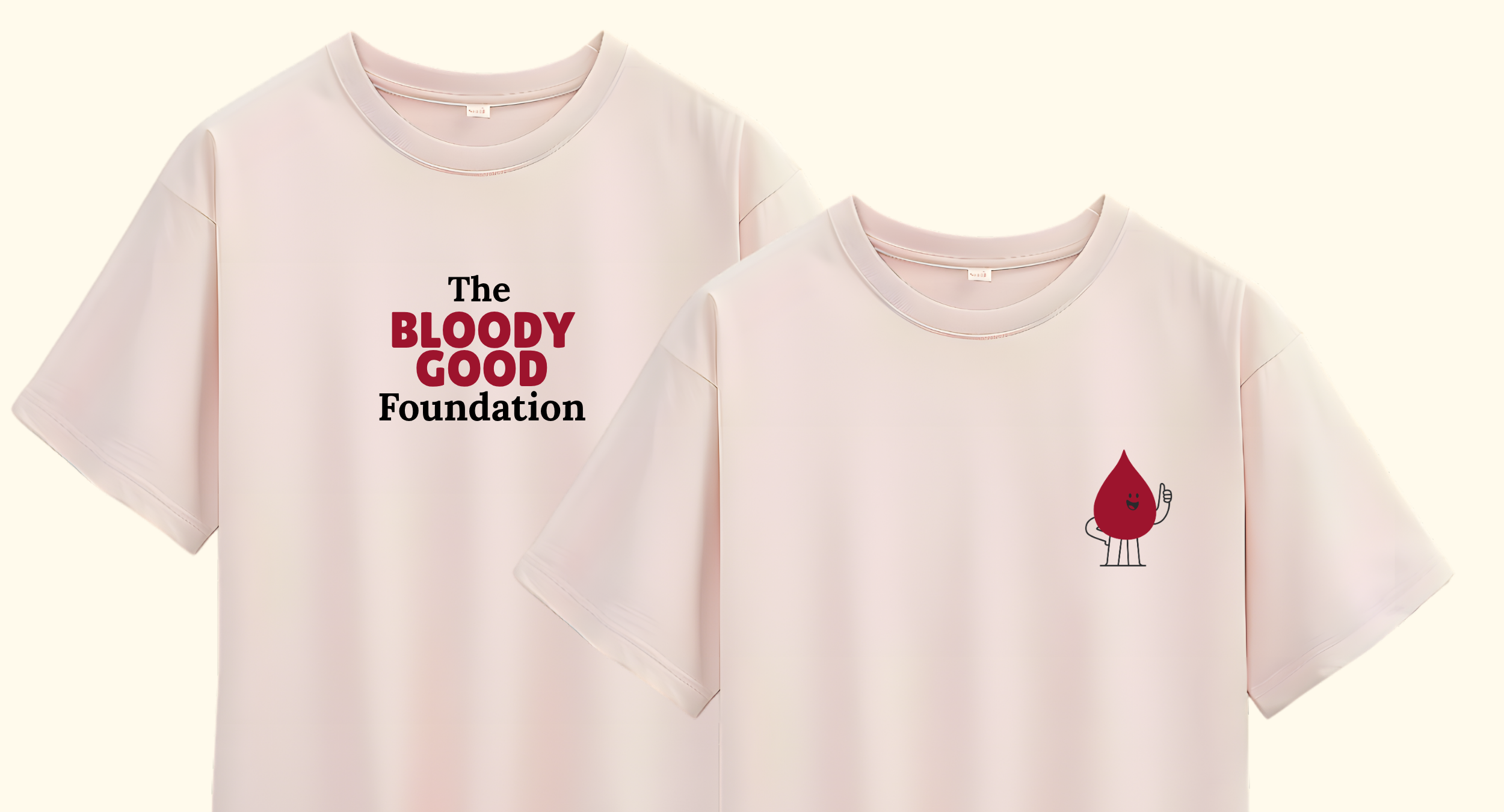
The look: The visual identity carries the same bloody heart through every touchpoint. Bold, approachable and full of personality, the brand is fronted by one bloody good mascot, a friendly face ready for fundraising events, merch and social content across the Hunter. The result is a charity brand people want to wear, share and support.
SCOPE
+ Brand Identity Strategy
+ Communications approach (messaging)
+ Visual Identity (logo & brand mark)
+ Website design & development